
Love Apple’s New Burgundy? Here’s How to Bring the Colour Into Your Workspace
Burgundy is having a moment.
With Apple introducing an all-new Burgundy finish for the iPhone 18 Pro and iPhone 18 Pro Max, the deep red colour has quickly become one of the most noticeable shades in this year’s tech aesthetic. Apple currently offers the iPhone 18 Pro line-up in black, silver, glacier and burgundy.
But Burgundy does not have to stop at your phone.
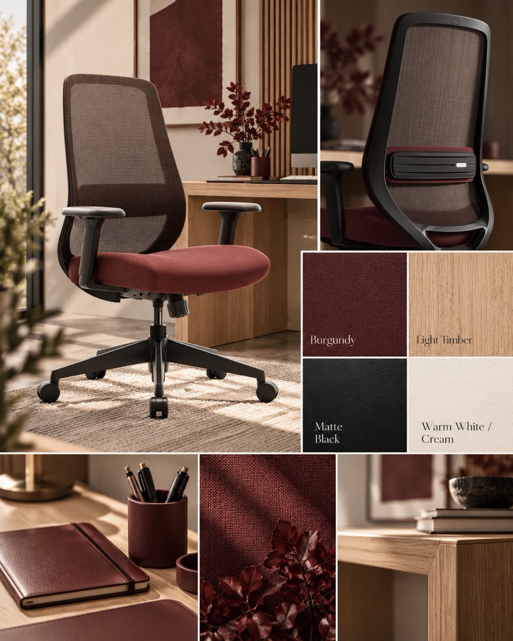
Its warm, rich character also works surprisingly well in a home office, especially when paired with neutral furniture, natural timber and darker accessories.
If you like the new Burgundy colour direction but do not want to turn your entire workspace red, the easiest approach is to start with one statement piece.
For Joy Desk, that could be the Mova LITE – Mid-Back Task Chair Maroon.
The Mova LITE is officially Maroon rather than Burgundy, but the two sit within a similar deep, warm red colour family — making it a natural fit for a Burgundy-inspired desk setup.
Why Burgundy Is Everywhere in 2026
Deep red shades have a very different visual effect from bright primary red.
Burgundy feels darker, warmer and more muted. Rather than immediately dominating a room, it can work almost like a neutral accent when surrounded by black, cream, grey or natural timber.
Apple's decision to introduce Burgundy to its latest Pro iPhone line-up has put that colour direction directly into the mainstream tech conversation.
For workspace styling, that matters because our phones, keyboards, monitors and desks are increasingly part of the same visual environment.
A colour that works on a premium device can also provide inspiration for the space around it.
Why Burgundy Works So Well in a Workspace
A workspace needs to feel visually interesting without becoming distracting.
That is where deeper shades such as Burgundy and Maroon work particularly well.
They introduce colour without creating the intensity of bright red, while still standing out from the black, white and grey furniture common in modern offices.
Burgundy-inspired tones pair especially well with:
- warm white
- black
- charcoal grey
- natural bamboo
- light oak
- walnut tones
- cream and beige
The key is restraint.
Instead of making the desk, wall, chair and accessories all the same colour, use Burgundy or Maroon as an anchor colour and build the rest of the workspace around it.
Start With One Statement Piece
One of the easiest ways to introduce colour into an office is through the chair.
It occupies enough visual space to influence the room, but it does not permanently define the entire interior in the way a painted wall or large piece of cabinetry might.
The Mova LITE – Mid-Back Task Chair Maroon gives you that kind of colour anchor.
Its Maroon fabric seat introduces a warm red accent, while the darker mesh back, armrests and base keep the overall appearance balanced.
And the colour is not the only reason it works as an everyday task chair.
Mova LITE includes:
- height-adjustable lumbar support
- 3D adjustable armrests
- an 8.5 cm double-curved fabric seat
- breathable mesh back
- synchro movement
- 96°–125° recline
- multi-position tilt lock
The 3D armrests provide 7 cm of height adjustment, 5 cm of sliding adjustment and 20° rotation in either direction. Joy Desk also currently lists a 10-year warranty and 14-day risk-free trial for the chair.
So the chair can work as both a visual statement and a practical part of the workstation.
Burgundy + White: Clean and Modern
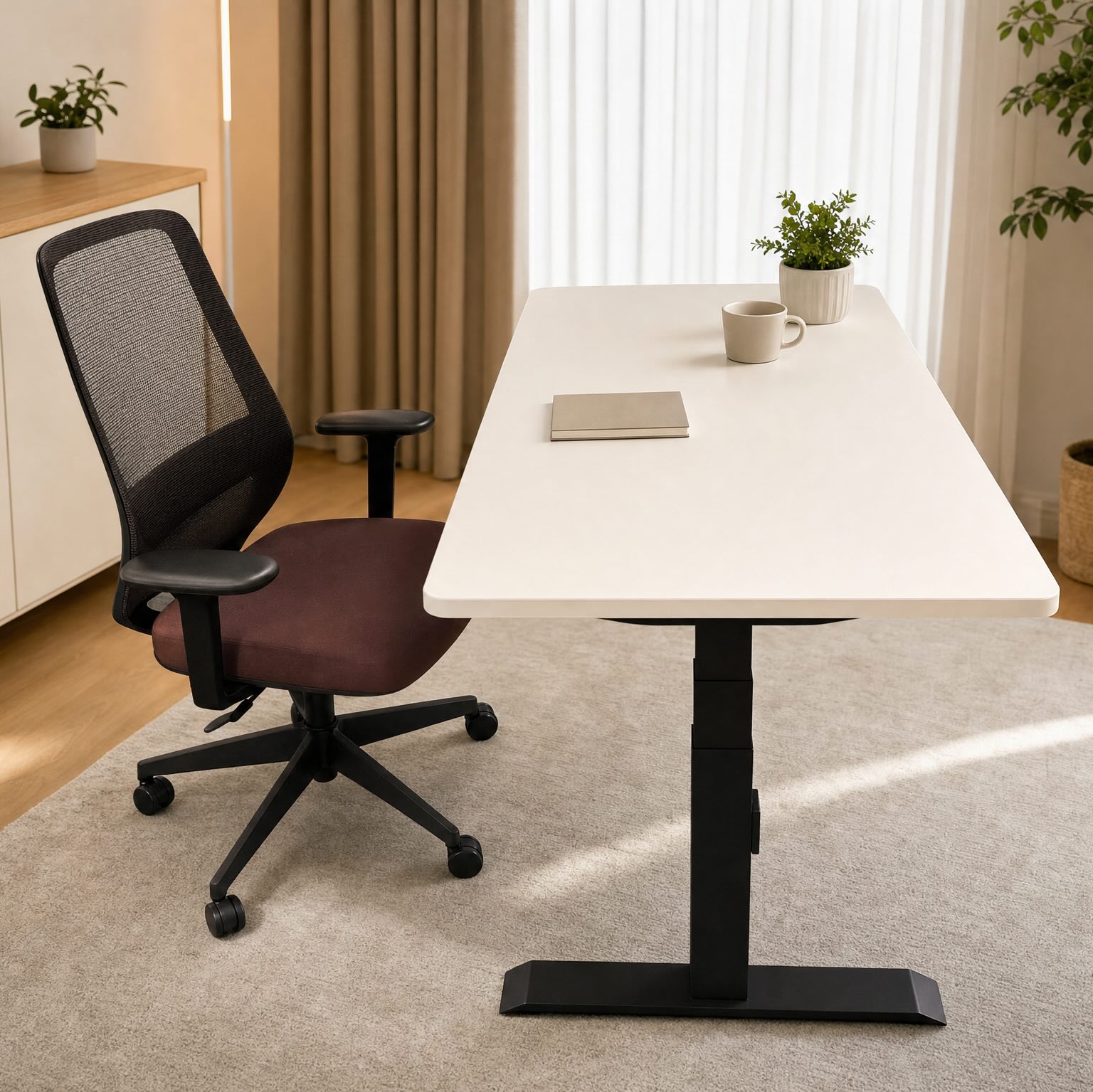
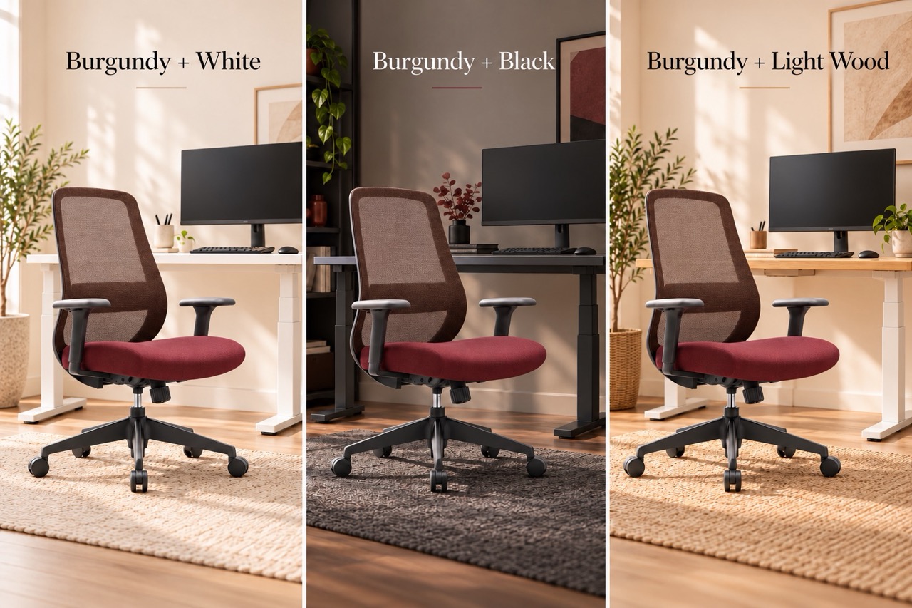
If you want the red tone to stand out clearly, pair it with white.
A white standing desk frame and light desktop create a bright background, allowing the Mova LITE Maroon seat to become the main colour feature.
This combination works especially well for:
- minimalist home offices
- small rooms
- bright interiors
- Scandinavian-inspired setups
You can then repeat the colour very lightly with something small — perhaps a notebook, phone case or desk accessory.
You do not need five Burgundy objects to make the palette feel intentional.
Burgundy + Black: Rich and Sophisticated
Black creates a very different result.
Pairing Maroon or Burgundy-inspired tones with a black desk frame, black monitor and dark accessories produces a richer, more dramatic workspace.
This works especially well for:
- gaming setups
- darker home offices
- dual-monitor workstations
- rooms with darker flooring or cabinetry
The trick is to prevent the room from becoming visually too heavy.
A lighter desktop, neutral wall or warm lighting can break up the darker elements.
Burgundy + Light Wood: Warm and Balanced
Natural timber is probably one of the easiest materials to pair with a deep red chair.
Light wood softens Burgundy and Maroon while reinforcing their warmer undertones.
Bamboo and light-oak-style desktops both work particularly well here.
If you are already comparing timber options for your workspace, you can also read our Bamboo vs Rubberwood Desk Guide.
A simple combination could be:
Light timber desktop + white frame + black monitor + Mova LITE Maroon
It gives you enough contrast to feel designed without making the workspace look overly themed.
Build the Workspace Around Your Mova LITE
Once you have chosen the chair as your statement colour, keep the rest of the setup relatively simple.
Keep large furniture neutral
Black, white and natural timber give you much more flexibility than trying to match every item to the chair.
Repeat the colour once or twice
A small Burgundy or dark-red accessory can make the chair feel intentional.
Think:
- notebook
- phone case
- desk mat detail
- artwork
- small planter
- storage accessory
Use black to connect the setup
Because the Mova LITE already includes darker components around the backrest, arms and base, black desk accessories naturally connect the chair to the rest of the workstation.
Don't chase an exact colour match
Burgundy, Maroon, wine red and oxblood can all vary significantly between materials and lighting.
You do not need every item to be the exact same shade.
A coordinated colour family usually looks more natural than trying to force a perfect match.
Colour Matters — But Comfort Still Comes First
It is easy to choose an office chair based entirely on appearance.
But if you work at your desk for several hours each day, adjustment matters too.
The Mova LITE allows you to reposition the lumbar support, adjust the armrests around your desk and change your reclining position using its synchro mechanism. Its mesh back also allows airflow, while the fabric seat provides a softer sitting surface.
That matters because a chair should fit into your workspace visually and physically.
You can explore the full specifications here:
View the Mova LITE – Mid-Back Task Chair Maroon →
Frequently Asked Questions
Is Burgundy a good colour for a home office?
Yes. Deeper red shades such as Burgundy can work well as accent colours because they provide warmth and visual interest without being as intense as bright red.
Is Maroon the same colour as Burgundy?
Not exactly. Both are deep red shades, but Burgundy generally has a wine-inspired tone, while Maroon can appear slightly browner or deeper depending on the material and lighting.
The Mova LITE is officially sold by Joy Desk as Maroon, not Burgundy.
What colours go well with a Maroon office chair?
White, black, charcoal, beige and light natural timber are all easy pairings. Using neutral furniture also allows the chair to remain the main colour feature.
Does the Mova LITE have adjustable lumbar support?
Yes. The Mova LITE has height-adjustable lumbar support, along with 3D armrests and a synchro reclining mechanism.